Imagine a tourist in town for Comic-Con, searching “best tacos near me” on her phone. If your site loads slowly or the buttons are too small to tap, she’ll look elsewhere, and Google notices, too.

Your website is often the first impression people have of your business, and these days, that first impression is usually on a phone. A “mobile-friendly” site doesn’t just look good on a small screen; it works seamlessly. And because Google wants to keep its searchers happy, it rewards sites that deliver a great mobile experience.
Here’s what that means for your business, how to tell if your site measures up, and what you can do about it.
What “Mobile-Friendly” Really Means
When most people hear “mobile-friendly,” they think “shrinks to fit.” While having a site that fits the users screen is a good start, Google and your customers expect more.
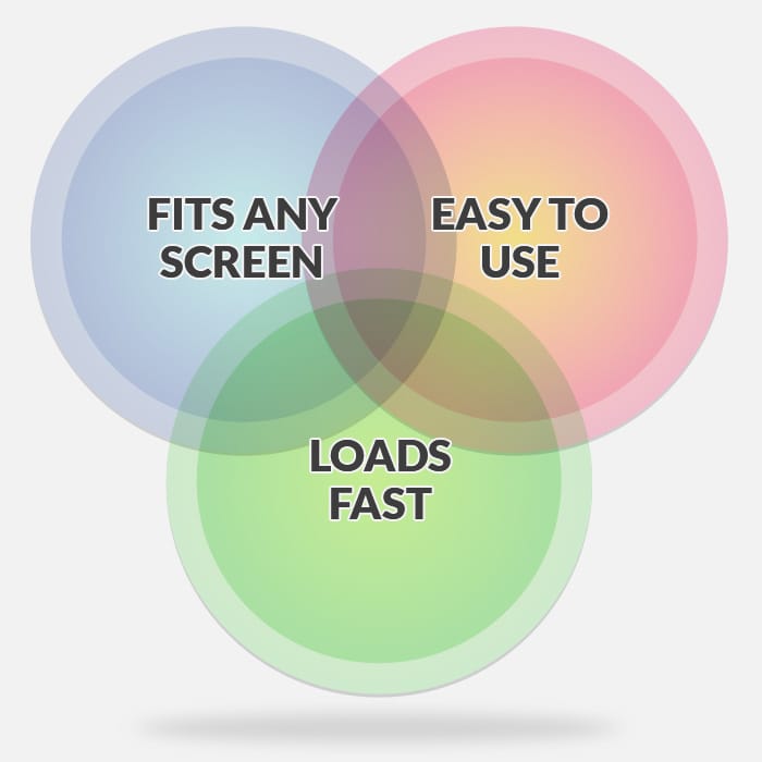
At its core, a mobile-friendly site adjusts to any screen size, loads quickly even on a spotty mobile connection, and feels frustration-free to navigate. Google even measures it.
The following are some things that Google, and your users, are looking for and what you should check:
Responsive Layout
The layout of your site should automatically resize to fit any screen, from a tiny phone to a big desktop monitor, without awkward zooming or sideways scrolling. A responsive web design will flow easily from one screen size to the next without requiring the user to make adjustments.
Largest Contentful Paint (LCP)
LCP measures the time it takes the largest visible element on your page (often your hero image or headline) to load fully. Waiting for a slow LCP feels like staring through a dark shop window. If you forget to turn the lights on, people will assume you’re closed.
You can use PageSpeed Insights to test your site’s LCP and other factors that affect user experience, such as Cumulative Layout Shift. Aim for an LCP under 2.5 seconds on mobile to minimize your bounce rate.
Cumulative Layout Shift (CLS)
Have you ever tried to tap a button only to have it jump out of the way just as your finger hits? Elements shifting around in your layout as the page loads is called CLS, and it can be very frustrating for your users. Ideally, you should be looking for zero layout shift in your content. Everything on the page should stay in place as it loads, no moving buttons or disappearing text.
Tap-Friendly Buttons & Spacing
On a small touchscreen, links and buttons must be big enough to tap comfortably, even for big thumbs. Google recommends at least 48×48 pixels for tappable areas, and at least 8–10 pixels of space between elements to avoid mis-taps.
Navigation, form elements, and buttons should all be easy to tap without zooming or accidentally tapping on a different element. Larger, well-spaced elements not only improve the experience for everyone, but they also make your site more accessible to users with limited dexterity or motor impairments.
Readable Fonts
Tiny, cramped text is one of the quickest ways to drive visitors away. Google recommends using a minimum font size of 16px for body text, with plenty of space between lines to ensure readability. Your text should be clear and legible at arm’s length on a phone screen.
Why a Mobile-Friendly Site Matters for Your Bottom Line
Let’s be real: mobile-friendliness isn’t just a nice-to-have. It can literally make or break your sales.
40% abandon a website that takes more than 3 seconds to load.
Here’s what the numbers say:
- Nearly half of mobile users will leave your site after waiting 3 seconds for a page to load.
- Improving your site’s speed by even a fraction of a second can boost mobile sales by 8% or more.
- More than 75% of people searching “near me” on mobile visit a business within 24 hours.
- Over 50% of users say they won’t recommend a business with a clunky mobile site.
In other words, if your site frustrates mobile visitors, they’ll head straight to your competition. Worse yet, Google may stop sending them your way altogether.
Your 4-Point Mobile-Friendly Checklist
Ready to see how your site stacks up? Here’s a quick self-audit you can do today:
1. Check Load Speed
Your website’s speed is one of the biggest factors in keeping mobile visitors around. A slow site feels broken, even if everything eventually loads.
Use PageSpeed Insights to test your site. Look for an LCP under 2.5 seconds. If your score is low, compress large images and remove unnecessary scripts. Don’t worry if you can’t get a perfect score, focus on fixing the biggest issues first, and aim for improvement rather than perfection.
2. View Your Site on Multiple Screens
Phones come in dozens of sizes. Even if your site looks fine on your laptop, it could break on an iPhone Mini or an Android tablet.
Open your browser’s developer tools or borrow a friend’s phone. Check everything to ensure it fits without sideways scrolling, tiny text, or other issues that require unexpected manual scrolling or zooming.
3. Test Buttons & Links
On a mobile screen, even small mistakes in button size or spacing can frustrate visitors.
Tap your navigation menu, CTAs, and form elements using your thumb. Ideally, tappable elements should be at least 48×48 pixels, with 8–10 pixels of space between them.
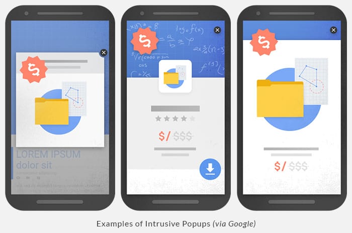
4. Kill Annoying Pop-Ups
Intrusive pop-ups are one of the biggest turn-offs for mobile users, and Google penalizes sites that use them. Google itself offers examples of intrusive pop-ups and safe alternatives. If you’re using pop-ups on your site, take a few minutes to make sure they’re mobile-friendly. It could pay off in search traffic you might otherwise be losing.
DIY Fixes vs. Calling a Pro
Some issues you can tackle yourself, others are better left to a pro.
| What You Can Tackle Yourself | When It Pays to Hire |
|---|---|
| Install caching & compression plugins | Digging into bloated themes & servers |
| Replace full-screen pop-ups | Redesign navigation & layout |
| Resize images & adjust font sizes | Comprehensive performance overhaul |
If you’re spending more than two nights trying to figure it out or worrying about breaking your site, it’s probably time to hand it off.
That said, if your budget is tight, start with the DIY fixes listed above. Even small improvements, like resizing images or removing popups, can make a noticeable difference while you plan for a bigger upgrade down the road.
Sources:
- Website Loading Time Statistics (2025)
- How Loading Time Affects Your Bottom Line (pdf)
- Mobile Page Speed: Ranking of Lead Generation Landing Pages
- Website Load Time & Speed Statistics: Is Your Site Fast Enough?
- 50+ small business website statistics for 2025
- Largest Contentful Paint (LCP)
- Tap targets are not sized appropriately