Most small business websites don’t have a conversion problem, they have a communication problem. If you’ve been wondering why your website isn’t converting visitors into leads, I’ll explain some reasons why that happens and what you can do about it.
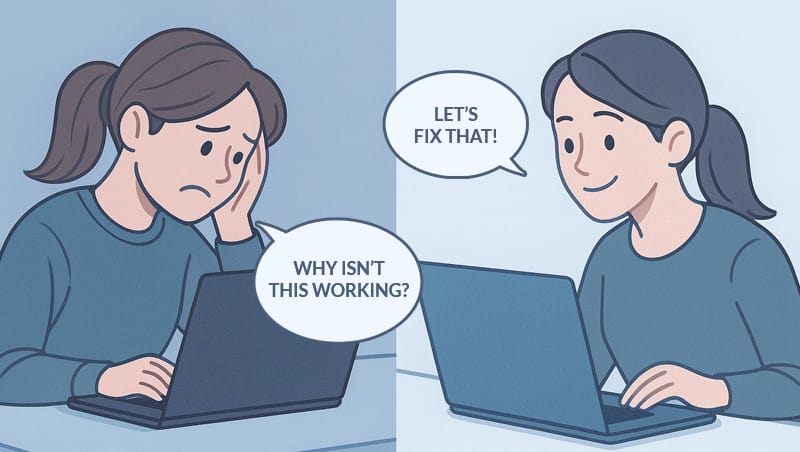
The primary goal of a small business website is to convert casual visitors into customers. However, when pages load slowly, messaging is unclear, or forms feel like a chore, even the most interested prospects tend to slip away.
In fact, the average website converts under 4% of its traffic into leads or sales. For mobile users, it’s often closer to 2%. That means for every 100 people who land on your site, up to 98 of them will leave before they ever reach one of your conversion goals, like subscribing to your newsletter or booking a meeting.
The good news? You don’t need a full-blown marketing team to improve those odds. This guide walks you through six simple but high-impact website upgrades. Each suggestion is grounded in proven research and tailored for time-strapped small business owners.
1. Clarify Your Value Proposition
First impressions happen above the fold.
When someone visits your website, they’re looking for an immediate answer:
Am I in the right place?
The part of your homepage they see before scrolling, called “above the fold”, is where they make their judgements. According to an eye-tracking study by the Nielsen Norman Group, the area above the fold receives 84% of a user’s viewing time, and 102% more attention than the area just below it.
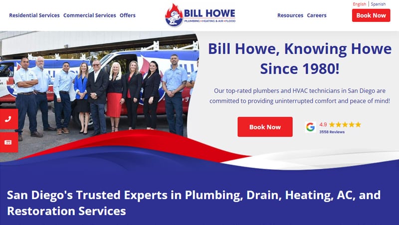
Bill Howe makes effective use of the area above the fold to improve website conversions.
That means your most valuable real estate is the very first headline and image a visitor sees. If that space is cluttered with jargon, vague slogans, stock imagery, or other elements that don’t immediately address your visitors’ questions, your message may get lost.
Make your message simple, specific, and benefit-driven.
Instead of asking people to “Explore Our Solutions” or “Learn More,” try telling them specifically what you offer, who it’s for, and why it matters.
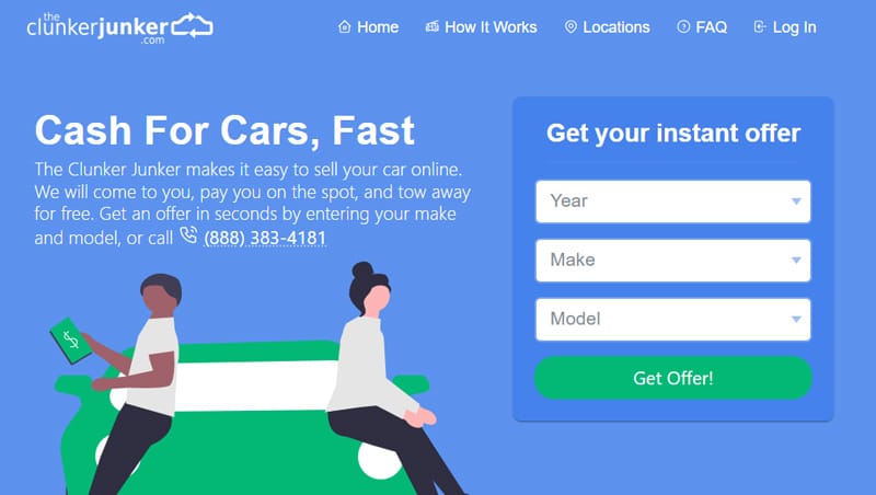
The Clunker Junker gets right to the point with simple, benefit-driven messaging.
Think:
- “Custom Cakes for Special Celebrations Delivered Fresh to Your Door”
- or “Flexible Personal Training That Fits Your Busy Schedule.”
Pair your value proposition with a relevant visual that reflects the end benefit.
Rather than using stock photography, take a few pictures in and around your store or office, or use actual photos of your products being used. Give your visitors a peek inside your business and share a little of your culture.

Arthur Murray pairs strong imagery with simple messaging and a clear call to action.
If you’re unsure whether your messaging is landing, have a friend or someone outside your business read it. If they can’t explain what you do in less than 10 seconds, it’s time to tighten things up.
For more insights, check out my guide to common small business website mistakes.
2. Build Trust With Social Proof
Why trust signals drive conversions.
People are naturally skeptical online, especially when they’re making decisions about who to hire or where to spend their money. Using trust-building elements like testimonials, reviews, certifications, and recognizable logos all work to improve your credibility, and they play a critical role in conversion rate optimization (CRO).
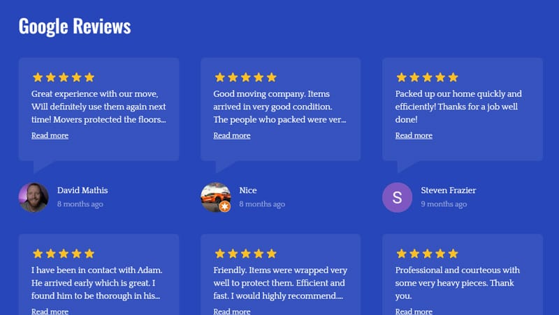
Adams Moving & Storage uses customer reviews from Google for social proof.
Research by Edelman found that 81% of people need to trust a brand before making a purchase. Another study by TrustPilot showed that 86% of visitors are more likely to buy from a site that displays star ratings, and 66% feel more confident when security badges or verified payment logos are present.
Add proof that you’re genuine, reliable, and recommended.
Trust signals don’t have to be complicated. Even a single testimonial placed just below your hero section can go a long way in reducing friction. If you’ve worked with recognizable clients or been mentioned in the media, consider adding a logo bar. And if you accept online payments, show your SSL security badge and supported payment providers near the checkout area or contact form.
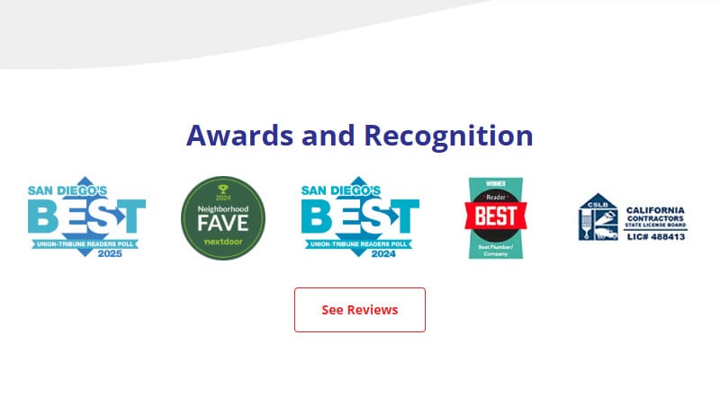
Bill Howe features Awards and Recognition trust badges before presenting customer reviews.
For service-based businesses, feature a rotation of recent reviews or ask your customers if you can share their stories on your site. Ideally, these quotes highlight outcomes, not just praise.
3. Strengthen Your Calls to Action (CTAs)
CTAs aren’t just buttons, they’re choices.
A call to action is the bridge between interest and engagement. Whether it’s “Book Now,” “Download the Guide,” or “Get a Quote,” your CTA tells visitors what to do next. But many small business sites bury their CTAs at the bottom of the page or dilute their impact with generic language.
According to HubSpot, personalized CTAs like “Send Message” and “Get Started” convert up to 202% better than generic CTAs like “Submit” or “Click Here”. Personalized CTAs have higher conversion rates than generic ones because they speak directly to the reader wherever they are in the sales funnel.
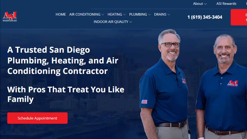
ASI Heating & Air CTA button keeps it simple with “Schedule Appointment.”
For example, users searching Google for “buy car insurance” are in a different stage of the sales funnel than users searching for “car insurance cost.” For each of these stages, you might build out a different landing page with a separate, personalized CTA. For users in the buying stage, try using a CTA like “Get Started.” And for users who are researching insurance prices, try using a CTA like “Compare Our Prices.”
If you’re looking for some inspiration to break your writer’s block, check out HubSpot’s article 49 Call-to-Action Examples You Can’t Help But Click.
Make the next step clear, easy, and engaging.
The key to creating effective CTAs is writing text that matches the user’s mindset. If they’re browsing for a quote, try “Get My Free Estimate.” If you’re offering a consultation, something like “Book Your Free Consultation” works well. Keep it short (2–5 words), action-oriented, and framed around your customer’s benefit.
Placement matters too.
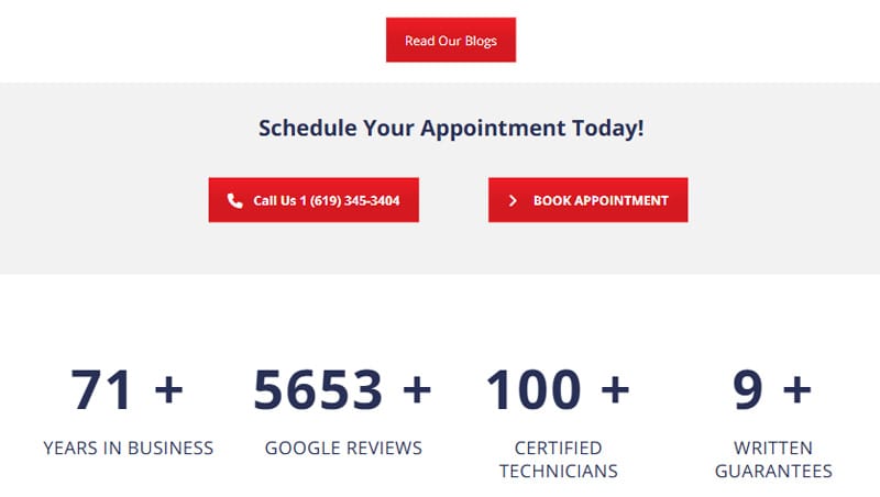
ASI Heating & Air uses repetition and bold contrast to bring attention to their CTAs.
CTAs should appear more than once. Shoot for including your CTA in the hero section (above the fold), midway through the page, and at the end to increase the odds of your readers seeing it. And make them stand out by using a contrasting color and plenty of whitespace.
Get creative with your CTAs. The point is to draw the attention of your reader.
4. Fix Mobile User Experience
Mobile UX is conversion-critical.
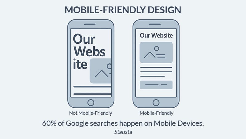
More than half of all website traffic now comes from mobile devices. Yet many small business sites still perform worse on mobile than on desktops, not because of poor content, but because a frustrating mobile experience matters for conversions. Slow load times, tiny buttons, cluttered layouts, and intrusive advertisements make the site hard to browse, let alone make a purchase or complete a form.
According to Google, 53% of mobile users abandon a site that takes longer than 3 seconds to load, and 1 out of 2 expect a page to load in less than 2 seconds. Combine that with awkward navigation or forms that don’t fit on screen, and you’ve lost most of your mobile users before they even get started.
Design for thumbs, not mice.
To improve your mobile experience, start by:
- Simplifying you navigation (4–5 essential links + a hamburger icon).
- Using fonts large enough to be read at arm’s length (min. 12-14px).
One of the best ways to make your site mobile-friendly is to make it easy for your users to avoid making mistakes.
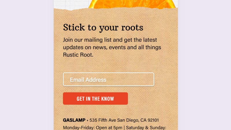
Rustic Root sticks to best practices with its font sizes and mailing list sign-up form.
- Google recommends tap targets (buttons, links, etc.) are at least 48×48 pixels.
- Ensure form fields are big enough to tap easily and that they aren’t too close to one another.
Read What Makes a Website Mobile-Friendly and Why Google Cares for more tips on improving your mobile user experience.
5. Improve Page Speed and Core Web Vitals
Don’t keep your visitors waiting.
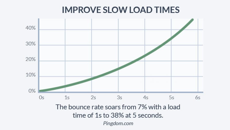
Every second your site takes to load increases the likelihood that a visitor will leave. Research from Pingdom shows that by the time you reach a 5-second load time, bounce rates skyrocket to 38%.
Google also now considers Core Web Vitals, which measure how quickly your site loads and becomes fully interactive, as a ranking factor. In short, faster sites not only convert better, they also rank better.
Quick fixes for faster WordPress sites
If your site is on WordPress, start by running a free test at PageSpeed Insights. It will show you key metrics, like Largest Contentful Paint (LCP), and suggested improvements.
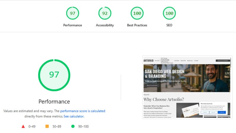
Example PageSpeed Insights report.
From there, compress all images (under 150 KB is a good rule of thumb), remove unused plugins, and install tools like WP Super Cache or Autoptimize to handle caching and script deferral. Some optimization tools can also help by preloading your primary fonts and lazy-loading any images that appear below the fold. Each optimization plugin has a different set of capabilities. Do a little research and choose the one that best suits your needs.
If you’re struggling with a slow WordPress site, be sure to read Why is My WordPress Site Slow? How to Speed it Up Without Rebuilding. In it, I cover several reasons that could be slowing your site down and six ways to speed it up that you can implement right now with little to no coding experience.
6. Simplify Your Forms
The real reason people abandon forms.
You’ve done the hard work of convincing someone to get in touch. Don’t lose them at the final step. Overly long or intrusive contact forms are one of the most common reasons users abandon conversion funnels. This often explains why no one is filling out your website form, especially if fields are confusing or too long.
Zuko’s form conversion studies have shown that:
- Only 45% of users who visit a form convert successfully.
- Requiring a phone number increases form abandonment by an average of 6.3%.
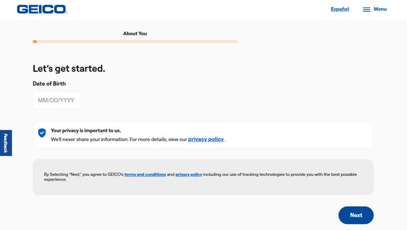
Geico uses a multi-step form to simplify the process of getting a quote.
Meanwhile, multi-step forms broken up over multiple pages or screens often perform better than one long scroll, boosting conversions by up to 300%.
Ask only for what you need.
Contrary to popular belief, there is no ideal number of form fields. Best practice is to use only the minimum number of fields needed to deliver your purpose and satisfy the user’s expectations.
Start with the essentials:
- Name
- A simple qualifying question, like “What are you hoping to improve?”
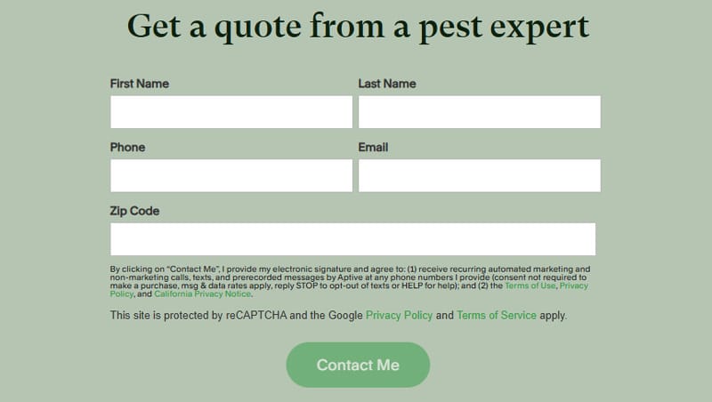
Aptive Pest Control could condense this form down name, email, & zip to improve conversions.
Avoid unnecessary fields, especially those that request personal information you can ask for later. Add real-time error messages so users can correct mistakes without a page reload.
If you need to collect more info for, say, a quote or custom order, use a multi-step form. Breaking the process into two or three shorter screens makes it feel more manageable and reduces the rate of form abandonment.
What to Fix First, and How to Prioritize
Don’t try to fix everything at once. Use a simple audit to spot your top issues:
- Look at bounce rates in Google Analytics
- Watch screen recordings with tools like Hotjar
- Ask a friend to test your site on mobile
Then pick 1–2 high-impact areas and start there.
When to Get Professional Help
If you’ve made the obvious fixes and still aren’t getting leads, it might be time to bring in a specialist. An experienced designer or CRO consultant can:
- Redesign key pages
- Improve UX and flow
- Set up conversion tracking in Google Analytics
Find Out What it Will Take to Get Your Site Converting
If you’ve read this far, then you’re probably looking for any competitive advantage you can find. I offer:
- UX/UI audits with deep insights explaining how to optimize your user experience.
- Mobile-friendly website re-designs to make sure your site looks great on any device.
- WordPress website development and optimization for a fast, reliable website.
One Fix Can Make a Big Difference
Improving your website conversion rate doesn’t have to mean a full redesign. Small, smart changes, like rewriting your headline or simplifying a form, can lead to big improvements in performance.
The key is to take action. Start with one fix from this list and build from there.
Sources:
- Website Traffic-to-Lead Conversion Rate: 2025 Report
- Scrolling and Attention
- Edelman: ‘Trust Has Become A Game Changer For Brands’
- The Psychology Behind Trust Signals
- 15 Call-to-Action Statistics You Need to Know About to Increase Your Conversion Rate
- The need for speed: Better user experiences, better publisher revenue
- Tap targets are not sized appropriately
- Does Page Load Time Really Affect Bounce Rate?
- Web Vitals
- 25 Conversion Rate Statistics you need in 2025
- How to Create Multi-Step Forms That Convert: A Guide
- How Many Fields Should an Enquiry Form Have For Maximum Conversion?
Frequently Asked Questions
Have more questions? Send me a message.
What is a good website conversion rate for small businesses?
A “good” conversion rate depends on your industry, but most small business websites convert between 2–5% of visitors into leads or sales. For service-based businesses, even 3% can be solid, especially if traffic is highly targeted.
Why isn’t my website converting visitors into leads?
The most common reasons include unclear messaging, weak calls to action, slow page speed, or a frustrating mobile experience. It’s usually a communication or trust issue, not a traffic issue.
How do I track my website conversion rate?
You can track conversion rate by dividing the number of conversions (form submissions, calls, etc.) by total website sessions. Google Analytics is both free and popular. It has a bit of a learning curve, but when configured correctly, it can tell you just about anything you want to know about your website traffic.
How do I make my website more trustworthy?
In addition to making sure your site is mobile-friendly, loads fast, and looks professional, you can add customer testimonials & reviews, share client logos or case-studies, display security badges (for payments), and add photos of your team or workspace.
Can a lead magnet help increase website conversions?
Absolutely. Lead magnets like free checklists, guides, or discount codes give visitors a reason to engage.